Grid layout in CSS

Software Developer from India. Inspired to join in tech from Google IO 2021. I like to travel, play table tennis, and work in open source. Open to remote work opportunities
Table of Contents
- Introduction
- Grid Elements
- Display property
- Commonly used values
- Grid columns
- Grid rows
- Grid gaps
- References
1. Introduction
A Grid is a collection of horizontal and vertical lines creating a pattern against which we can line up our design elements. We use this column-based structure to place text, images, and d in a consistent way throughout the design.
Consider the grids we find in Maps. Islands, towns, lakes will appear on an exact part of a map, on a set of North-South/East-West coordinates. They will always appear in the same place on other maps. Some of the other examples are as follows:
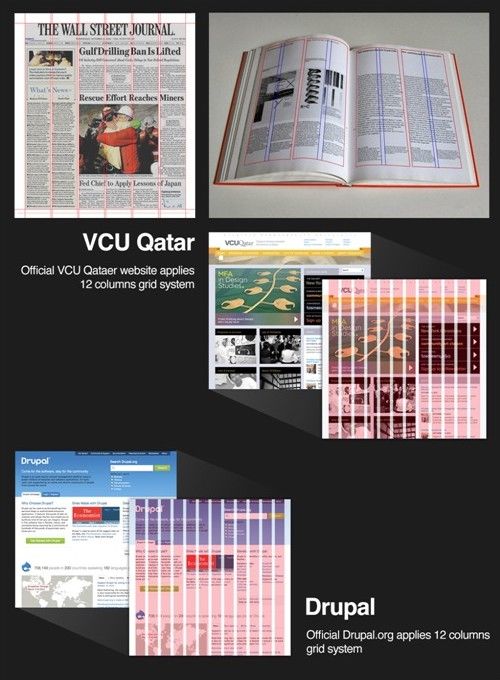
As we can see, The grid system was first used to arrange handwriting on paper and then in publishing to organize the layout of printed pages. Given that the printed page and the virtual page have much in common, it should come as no surprise that we also use it in web and app design.
2. Grid elements
A grid layout consists of a parent element, with one or more child elements.
Let us consider the following to be the HTML contents of the body:
<div class="grid-container">
  <div class="grid-item">1</div>
  <div class="grid-item">2</div>
  <div class="grid-item">3</div>
  <div class="grid-item">4</div>
  <div class="grid-item">5</div>
  <div class="grid-item">6</div>
  <div class="grid-item">7</div>
  <div class="grid-item">8</div>
  <div class="grid-item">9</div>
</div>
Now, We are having the structure of the webpage ready, but it looks unattractive to just look at it. Let us add some styling properties to make it more beautiful.
3. Display property
Here, We have set the display property to the grid to make a block-level grid container.
.grid-container {
  display: grid;
  grid-template-columns: repeat(3, 1fr);
  background-color: #2196F3;
  padding: 10px;
}
Let me explain what the above snippet does to the webpage.
The first CSS property "display" will display the contents in a grid format, Meaning the contents can be placed vertically or horizontally based on the values given to the properties.
The second CSS property "grid-template-columns" in the snippet will specify the number of columns in the grid layout.
The third CSS property "background-color" will give the background-color to the contents of the grid.
The fourth CSS property "padding" will display the spacing around the contents of the grid.
The display CSS property sets whether an element is treated as a block or inline element and the layout used for its children, such as flow layout, grid or flex. There are many kinds of display properties which you can try out. Some of the famous ones are:
- display: block;
- display: inline;
- display: flex;
- display: inline-grid;
- display: inline-flex;
- display: contents;
- display: table;
All direct children of the grid container automatically become grid items.
4. Commonly used values
inherit - The inherit CSS keyword causes the element for which it is specified to take the computed value of the property from its parent element. Let's take an example:
/* Make second-level headers green */
h2 { color: green;
}

/* ...but leave those in the sidebar alone so they use their parent's color */
#sidebar h2 { color: inherit;
}
initial - The initial value of a CSS property is its default value. The usage of the initial value depends on whether a property is inherited or not:
- For inherited properties, the initial value is used on the root element only, as long as no specified value is supplied.
- For non-inherited properties, the initial value is used on all elements, as long as no specified value is supplied.
- revert - The revert CSS keyword resets the property to its inherited value if it inherits from its parent or to the default value of the stylesheet.
- unset - The unset CSS keyword resets a property to its inherited value if the property naturally inherits from its parent, and to its initial value if not.
Let us see the differences between the unset and revert with an example
<h3 style="font-weight: unset; color: unset;">This will still have font-weight: normal, but color: black</h3>

<p>Just some text</p>

<h3 style="font-weight: revert; color: revert;">This should have its original font-weight (bold) and color: black</h3>

<p>Just some text</p>
Output is:
This will still have font-weight: normal, but color: black
Just some text
This should have its original font-weight (bold) and color: black
Just some text
Here, We observe that in the first case, The font-weight is set to unset and hence we do not get any styling. In the second case, The font-weight is set to revert, Therefore, whatever the styling is given to it is ignored and reverted to its property of the parent element.
5. Grid columns
The vertical lines of grid items are called Columns. It can be used in the placement of the items in the right positions of the grid.
grid-column: 1;
This snippet specifies the column in which the grid item is placed.
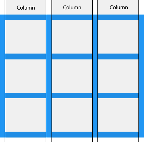
6. Grid Rows
The horizontal lines of grid items are called Rows. It can be used in the placement of the items in the right positions of the grid.
grid-row: 1;
This snippet specifies the row in which the grid item is placed.
With the help of grid-columns and grid-rows, The contents can be placed and styled anywhere on the screen.
7. Grid gaps
The spaces between each column/row are called Gaps. Some of the values for gaps are the following:
gap: 0;

gap: 10%;

gap: 1em;

gap: 10px 20px;
This property is specified as a value for <'row-gap'> followed optionally by a value for <'column-gap'>.
If <'column-gap'> is omitted, it's set to the same value as <'row-gap'>.
<'row-gap'> and <'column-gap'> are each specified as a length or a percentage.
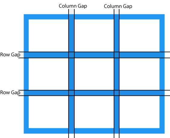
We can adjust the gap size by using one of the following properties:
- grid-column-gap
- grid-row-gap
- grid-gap


